Calculated Risk is one of my favorite blogs. Why? Because while economics can be pretty boring, the applications of economics are absolutely fascinating. Oh, and because of things like this:
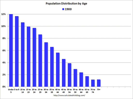
That’s the age distribution of the population of the United States from 1900 to 2060. Check out that Baby Boomer wave! Another cool thing is you can witness medical progress in this graph as well. Notice how it goes from a max of 75+ to 85+ to 100+ as the brackets become statistically significant. Also, look at how normalized the graph becomes after the wave. This signifies the mostly flat birth rate in the U.S. that we currently have.
I’m trying to come up with an explanation as to why the Baby Boom wave kind of peters out near the end like a wave getting eaten away by an undertow. The only thing that I can think of is general mortality slowly eats away at it. That doesn’t seem like it could be the whole story though. There has to be some other sort of statistical meaning behind it that I can not fathom. Anyone care to explain?
Pure speculation here. There has been a large wave of Hispanic immigrants over the past couple of decades. As a rule they have had a higher birthrate than more established citizens. Depending on the assumptions behind the graph, if you assume that trend to continue, then a higher birth rate overall would increase the percentage of young people.
You do see an increase in young around 1985, but it’s not sustained and it levels out to 6% shortly thereafter. Immigrants may have a higher birth rate when they come here, but the television soon fixes that problem.